
Instagram
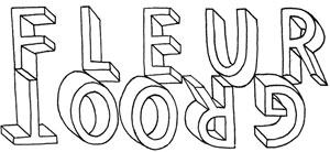
Title of the page in a hand drawn 3D font saying 'Fleur Groot' the 'Groot' is upside down underneath 'Fleur' Title of the page in a hand drawn 3D font saying 'Illustration, Design and other stuff' in between 'other' and 'stuff' three words switch on a loop the three words are 'cool', 'fun' and 'nice'

publications

A selection of publications developed for NGOs, international organisations, and development agencies, including training manuals, educational resources, and advocacy materials. The work emphasises clear visual systems, strong typographic hierarchy, and accessible design tailored to complex content.

Click fullscreen icon, or the top right of the publication cover, then use the arrows to view


forum für internationale entwicklung + planung (finep) Germany

Graphic Design of a 47-page digital brochure showcasing the best practices from 6 NoPlanetB Projects.

forum für internationale entwicklung + planung (finep) Germany

Design, layout and illustrations for a 140-page Ace Doubles-style publication with two asymmetrical sections, read from opposite directions. Developed a cohesive layout system for content tailored to sustainability practitioners (Part 1) and educators (Part 2), including cover design.

Tuol Sleng Cambodia

Graphic Design of a 104-page modular teaching manual (Violent Past) focused on education and memory work. Established a clear visual hierarchy and navigation system using chapter tabs and recurring layout elements, enabling intuitive use without reliance on page numbers. Applied a very limited colour palette to ensure cost-effective production and maintain clarity even when photocopied. Prepared print-ready files and adapted and typeset the Spanish edition to align with the original design system.

Pro Peace Cambodia

Design and layout for a 75-page bilingual (English–Khmer) training manual on conflict transformation, developed from an existing manual. Adapted and refined the original design into a consistent visual system to support modular activities and exercises while prioritising readability and accessibility. Prepared print-ready files with accurate bleed, margins, and binding specifications.

forum für internationale entwicklung + planung (finep) Germany

Design, layout and cover illustration for a 34-page dual-format publication for the Engagement 2030 project, using an Ace Doubles-style format with two asymmetrical sections, read from opposite directions. Developed the inside layout system and prepared files for both print and digital formats, including an interactive contents section.

forum für internationale entwicklung + planung (finep) Germany

Design, layout & illustrations for a 38-page booklet on degrowth and sufficiency, produced on uncoated paper to reflect the project’s environmental ethos. Worked within the established NOPLANETB colour palette and typography guidelines to ensure brand consistency, while creating a cohesive layout system balancing variation and structure. Prepared files for sustainable print production.
back to top